Design System
Jan 2018 - Jun 2022
Company
Spreetail
Industry
Ecommerce
My Role
Senior UX Designer / UX Engineer
Background
Spreetail buys, warehouses, and sells products online. Its internal software suite, known as Toolkit, consists of dozens of applications. Prior to this project, many of these applications had been built using inconsistent design methods. Toolkit lacked a clear design language and shared structure, making the overall experience feel fractured and a bit confusing for users. Alongside a core team of UX designers, I helped develop an internal design system for Spreetail.
?
How might we establish a design system that speeds up our design process and promotes consistency within our internal tools?
Step 1.
Discovery
UI Auditing & Holistic Understanding
During my time at Spreetail, I conducted several UI audits across our most trafficked applications. I was aiming to define common structures and patterns that
we'd need to address in our design system. I often worked closely with users and software teams to better understand why certain decisions had been made and
what was working well and not-so-well in our various tools. This also enabled me to abstract a relatively simple model of the core functions of our internal tools.
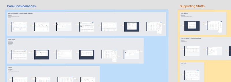
UI audit
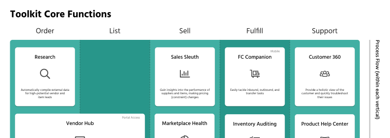
Toolkit core functions
Landscape Analysis
I helped conduct a landscape analysis of various design systems across other ecommerce and tech companies. For some of the larger companies that we researched,
we saw a pretty complete picture of everything we could possibly include in a design system. Now it was up to us to decide where to start. Which elements might be the most pertinent to design?

Design system landscape
Empathizing with Fellow Designers
With part of our goal for this project being improved UX designer efficiency, we took some time to reflect together. What did we struggle with in the
design process? What slowed us down the most? Without clear rules for basic UI elements or common layouts, sometimes it felt like we were reinventing the
wheel each time we began designing in a new space. This was something we sought to remedy through our design system.
Step 2.
Solutioning
Layout and Visual Foundations
The first thing we focused on during solutioning was creating an overarching layout that could be used on any page across our software suite. I started by sketching
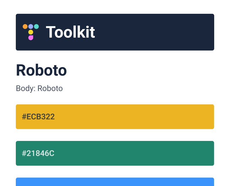
elements that we were certain we'd need - navigation, some sort of page title, and an area for page content. In parallel with these efforts, we also started exploring
typography and color for the system. We aimed to have a clear "why" for any inclusion as to prevent unnecessary complexity in our color or type palettes.
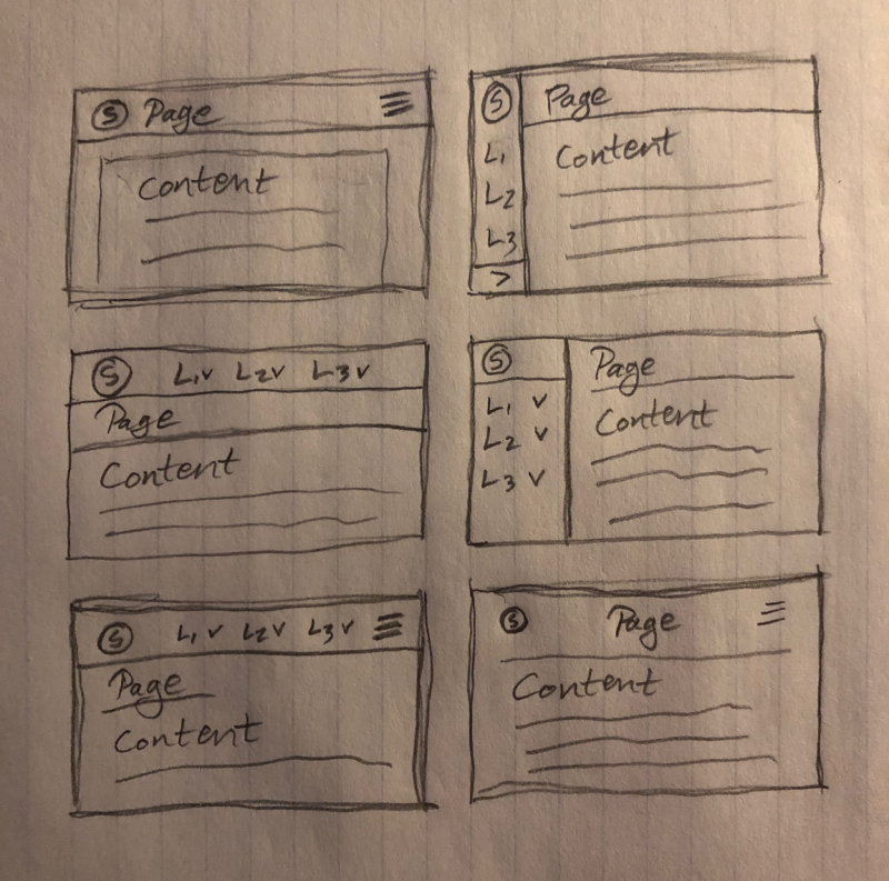
Early layout sketches
Toolkit core functions
Applied Testing
Once we developed some layouts and visuals that we felt good about, we began mocking existing tools using the new foundations of our design system. I did this
for several applications, getting feedback from users, product teams, and fellow designers. This helped us identify blind spots in our design system,
and I helped create a living list of considerations we'd need to address as a UX discipline. We steadily addressed these considerations through further iterations.
Redlining and a Love of Components
To provide a clear source of truth, we began creating a library of redlines and reusable Figma components - everything from buttons to multi-selects. I primarily made redlines, though I did
contribute to our components as well. Eventually, we worked with our front-end engineers to develop React components that mirrored our design library. Thus, we'd not only speed up
our design process, but also our development process.
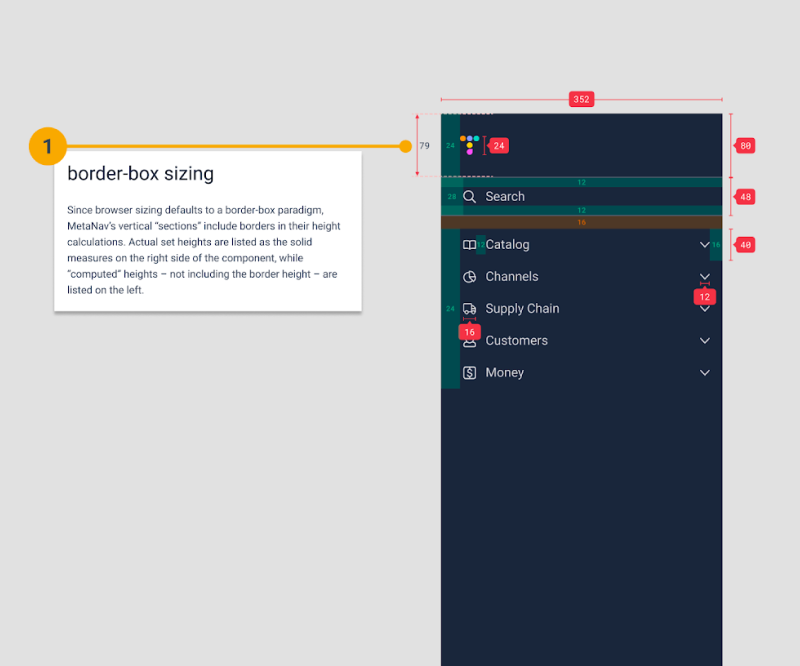
Navigation redline
Closing
Delivery & Impact
Our design system was perhaps one of the first coordinated, cross-departmental UX efforts at Spreetail and ushered in a new era of design for us. After our initial release, I continued to provide feedback through our design system support channel, pitching in on Figma resources as well. As a UX team, we consistently circled up to critique each other's work, solidify shared learnings, and grow our design system.
Feature Mix
- Color, Type, Voice, and Tone
- Core Layout and Navigation
- Reusable Figma and React Components
- Library of best practices for designers
Key Results
More efficient mocking
Shared Figma resources made foundational decisions easy.
More consistent experience
Our system promoted a common layout across internal tools.
Improved development speed
React components allowed for reuse instead of re-engineering.
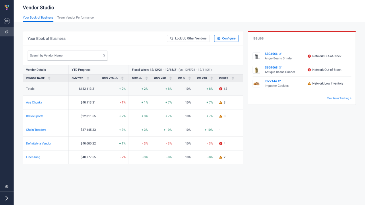
High-fidelity use of our design system