Vendor Portal
Jan 2021 - Jun 2022
Company
Spreetail
Industry
Ecommerce
My Role
Senior UX Designer / UX Engineer
Background
Spreetail buys, warehouses, and sells products online. The companies that provide those products are known as vendors. Prior to this project, most vendor interactions were highly manual. Internal teams had to frequently compile and communicate reports in an attempt to provide visibility into a vendor's overall performance with Spreetail. I led UX efforts across several software squads for this project, mentoring other designers and ensuring cohesion throughout.
?
How might we design a portal to enhance the experience of our vendor partners and improve the efficiency of our internal teams?
Step 1.
Discovery
Vendors - The Customer Need
Aligned to an initial goal of driving portal engagement, we wanted to learn more about our vendors -
their aspirations, their pain points, and more. I created discovery plans and led vendor interviews, even coaching another designer through
her first interview. We logged the occurrences of common topics to show quantitative trends in our conversations.
We vetted those trends and even identified typical vendor employee roles by conducting a related survey across ~500 vendor contacts.
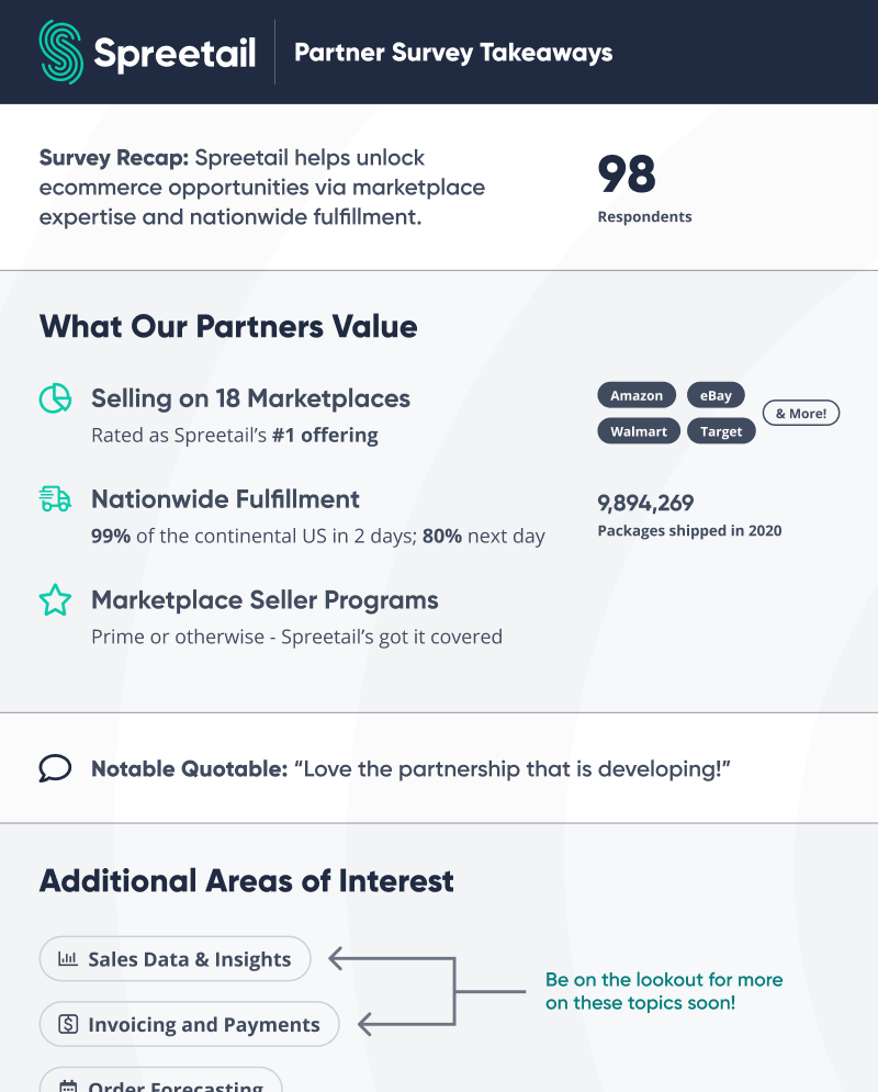
High-level survey results
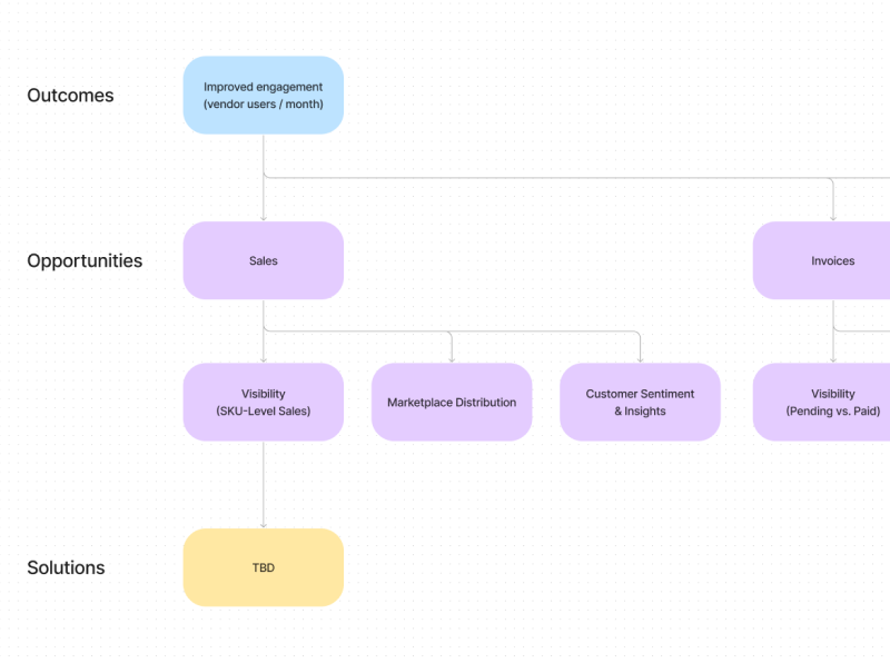
Early opportunity-solution tree
Internal Teams - The Business Need
To help suss out areas of shared value, we needed to understand the underlying goals
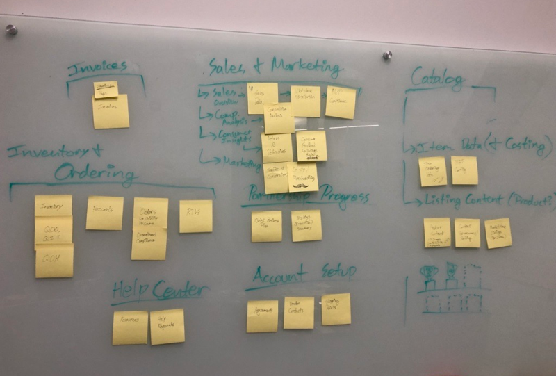
of our internal teams at Spreetail too. I shadowed vendor managers and hosted workshops to
map out our vendor support processes and pain-points. We cross-referenced those pains with
our vendor-sourced opportunities to build a more complete opportunity space and vendor journey map.
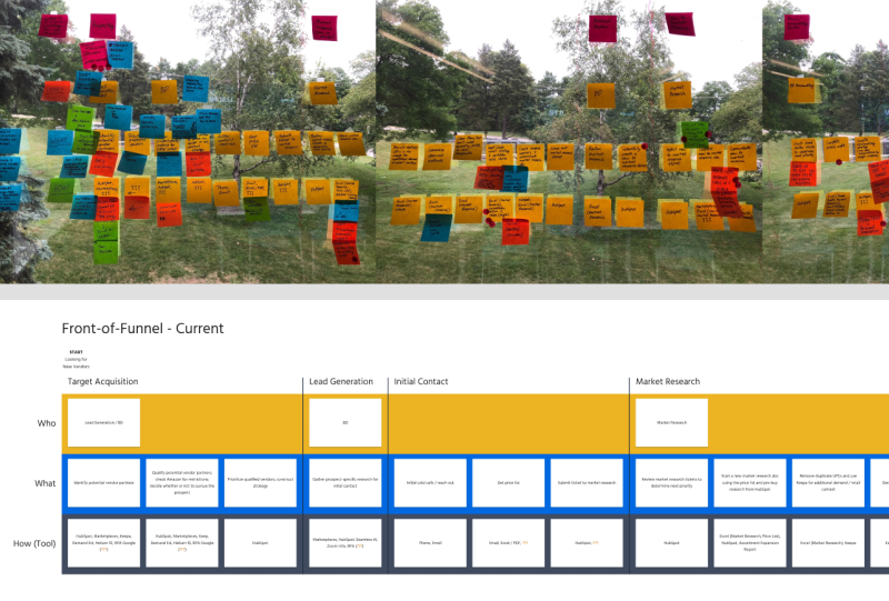
Workshop and process mapping
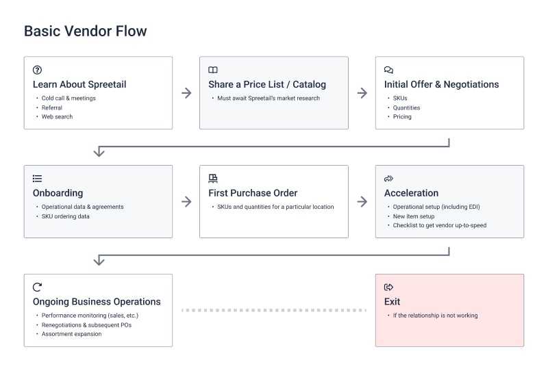
Basic vendor flow
Landscape Analysis
As kindling for ideas, we explored what competitors and online marketplaces provide in their software suites.
In this context, our team paid close attention to the emergent areas of interest from our vendor partners -
those being sales, associated insights, and invoices.
Step 2.
Solutioning
What should we focus on?
Based on our discovery efforts, we felt that sales and invoicing were solid bets to drive initial portal engagement. It's what our
vendors were most hungry for, and it was a space that often required support from our internal vendor managers. We were confident we'd not only provide
shared value in pursuing those opportunities, but we'd also set up for additional 2-way interaction once we established a solid userbase.
Early card sorting
Sketching and Early Mocks
To understand how our initial feature mix might fit together, we began sketching core flows for our portal app. We needed to cover the basics
like logging in and being able to navigate from page to page, but we also wanted to explore what a dashboard or sales page could include.
I kept it high-level and iterated quickly before transitioning to mock-ups. My early mocks were used to make sure we'd captured our core flows on desktop and mobile
and felt comfortable with our content and layouts therein. We aligned on development feasibility and product viability throughout.
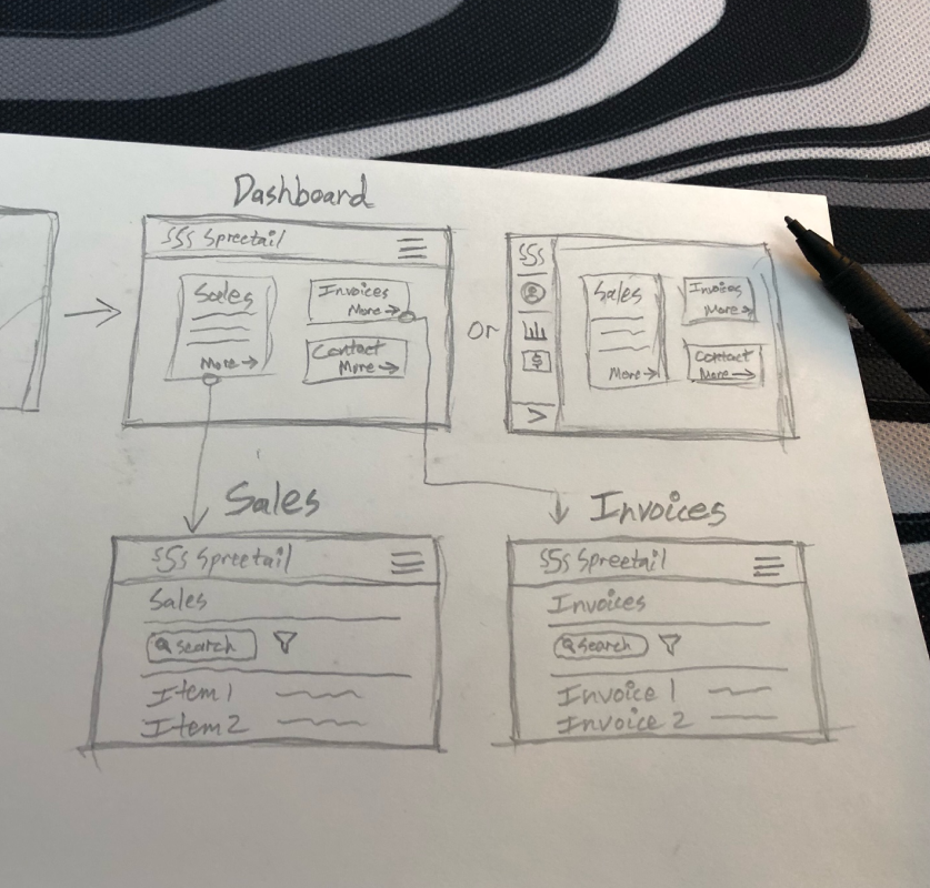
Core flow sketching
Mobile scaffolding
Prototyping, Testing, and High-Fidelity
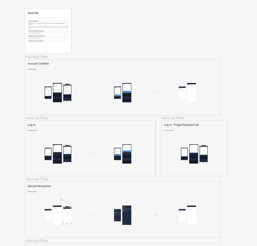
Now that we had a decent conceptual model of our initial portal experience, it was time to vet our core flows with some prototyping and testing.
I created Figma prototypes, conducted scenario tests with several of our vendors, and even critiqued the work of other designers in this space.
We quickly discovered areas for improvement, and much to our excitement, areas that genuinely excited our participants. After tweaking some layouts and content,
I worked with our internal branding and design system teams to settle on a visual approach.
High-fidelity prototype
Spreetail branding exploration
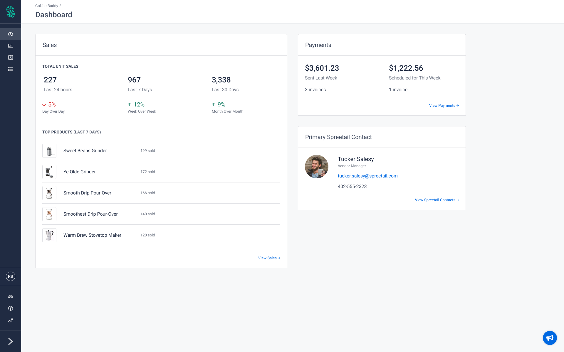
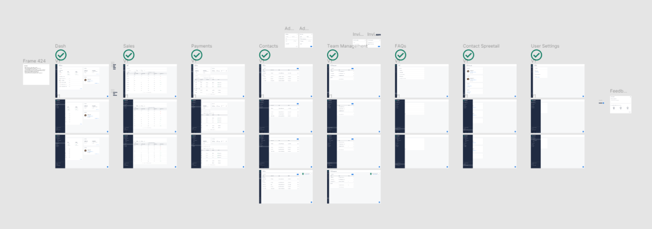
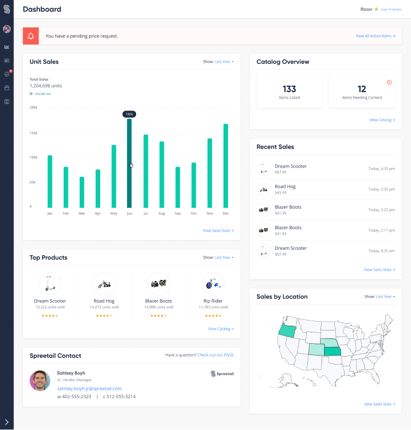
Portal dashboard MVP
Closing
Delivery & Impact
We conducted a beta test for quality assurance and another round of feedback before launch. In conjunction with our launch, set up logging and analytics to better understand how users were interacting with our application. I also created surveys for measuring portal satisfaction over time, and we continued talking with our vendor partners and internal teams to iterate existing features and build out new functionality. I was lucky enough to mentor several UX designers along the way.
Initial Feature Mix
- Product-level sales and trends
- Invoice visibility and status updates
- Account creation
- Team / user management
More Features That I Worked On
- Onboarding / acquisition
- Returns and defectives
- Consumer ratings and reviews
- Order visibility and forecasting
Key Results
~80% vendor engagement
This milestone was hit one year after the portal's launch.
Less time on manual reports
Internal teams can rely on the portal's reporting.
More timely insights
Vendors have near real-time performance visibility.
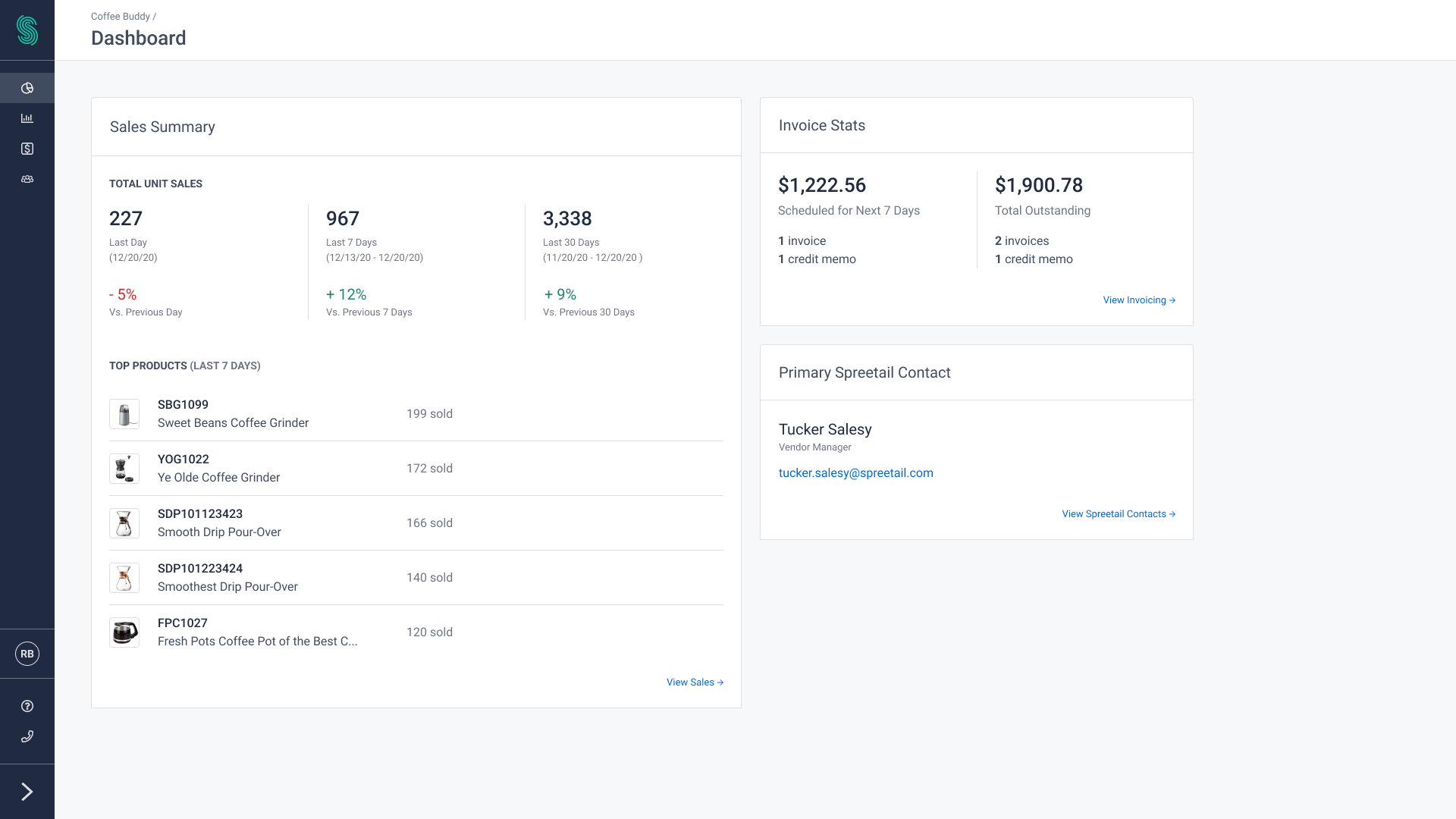
High-fidelity dashboard
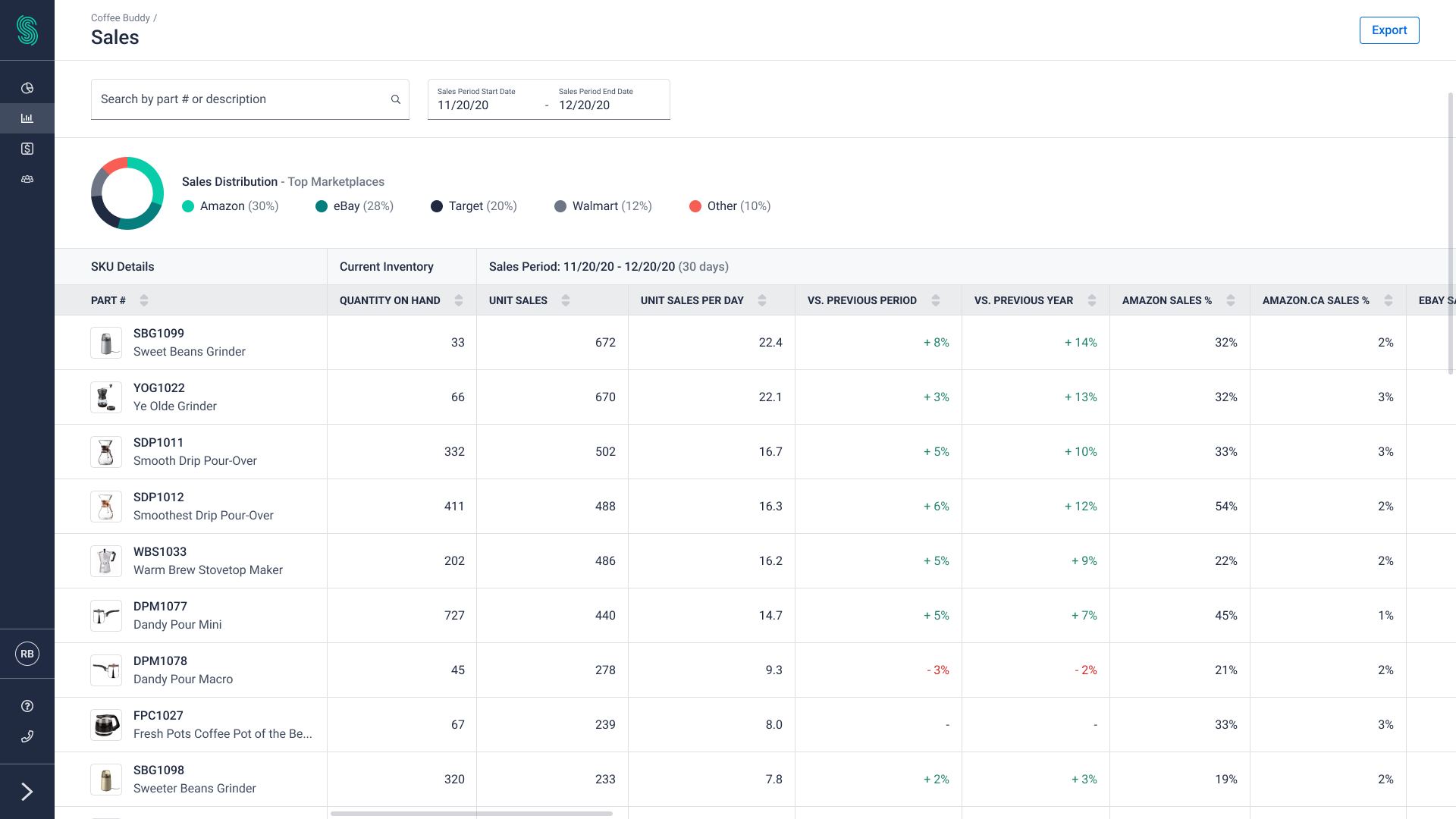
High-fidelity product performance